Contemporary residential facades have evolved beyond simple aesthetics to become sophisticated responses to climate, urban context, and how we live today. A well-designed facade balances visual impact with practical considerations like natural light, privacy, and material durability. This collection showcases 25 distinct approaches to modern house exteriors, each demonstrating how materials, proportions, and details combine to create compelling architectural statements.
Whether you’re drawn to minimalist concrete forms, warm timber cladding, or bold geometric compositions, these examples reveal the design principles that make contemporary facades successful. You’ll learn how architects use material contrasts, window placement, and spatial layering to shape both curb appeal and interior comfort.
Table of Contents
1. Mixed Material Two-Story with Corner Glazing

This two-story residence demonstrates how material contrast creates visual interest without sacrificing cohesion. The warm brick grounds the composition while dark grey metal cladding on the upper volume provides a modern counterpoint. The defining feature is the prominent glass corner window that wraps around the living room, dissolving the traditional boundary between interior and exterior at the most social part of the home.
The success of this design lies in its proportional balance. Rather than competing, the brick and metal cladding divide the facade into clearly defined zones that guide the eye naturally from ground to sky. The corner glazing works because it’s positioned where you’d want views and light most—in the main living space—while maintaining privacy in secondary areas. Soft morning light enhances the warmth of the brick and emphasizes the reflective quality of the metal, showing how this palette responds dynamically to changing conditions throughout the day.
2. Split-Level Butterfly Roof Design

A butterfly roof—two roof planes that slope toward the center rather than away from it—gives this split-level home its distinctive profile while serving a practical purpose: capturing rainwater at the central valley and creating dramatic ceiling heights inside. The facade combines horizontal cedar siding with large fiber cement panels, establishing a rhythm of warm organic texture against smooth industrial surfaces.

The elevated wooden deck extending from the front isn’t merely decorative. It creates an intermediate threshold between public street and private interior, a transitional space that makes the home feel welcoming without compromising privacy. The horizontal lines of the cedar siding emphasize the length of the structure, making it appear to nestle into the landscape rather than tower above it. This proportional strategy works particularly well for split-level designs where managing multiple floor heights can otherwise create visual confusion.
3. Modern Farmhouse with Vertical Batten Siding

The modern farmhouse aesthetic translates traditional rural typology into contemporary language through careful editing. White vertical batten siding provides crisp texture while referencing agricultural building traditions, but the proportions are refined—tighter spacing, cleaner joinery—compared to historical precedents. The high-pitched metal roof serves both practical and visual purposes: shedding snow and rain efficiently while creating generous attic volume that can be used as living space.

Black framed windows create sharp definition against the white facade, turning each opening into a deliberate compositional element rather than a perfunctory hole in the wall. The symmetrical front porch with simple timber columns reinforces the formal clarity of the design. Golden hour sunlight transforms this restrained palette, warming the white surface and casting long shadows from the porch columns that reveal the facade’s depth and layering.
4. Suspended Second Floor with Slate Cladding

This design inverts conventional logic by making the upper floor visually heavier than the ground level, creating immediate visual tension. The second floor, clad in dark slate tiles, appears to float above a transparent glass-enclosed ground floor. This strategy maximizes natural light and views at the living level while the suspended volume above provides drama and weather protection for outdoor spaces below.

Dark slate tiles absorb light rather than reflect it, giving the hovering mass genuine visual weight that makes the cantilever feel more daring. The ground floor’s full glazing dissolves boundaries between inside and outside, a move that works because the protected upper volume provides necessary privacy for bedrooms. Permeable pavers in the driveway continue the environmental consideration—allowing rainwater to infiltrate rather than run off—while soft, overcast lighting eliminates harsh shadows that might otherwise flatten this bold three-dimensional composition.
5. Asymmetrical Limestone Entry

Asymmetry gives this facade dynamism that a centered composition couldn’t achieve. The grand double-height entryway clad in light limestone becomes the visual anchor, but it’s deliberately positioned off-center. To one side, a garage with a sleek translucent glass door maintains the facade’s modern character without competing for attention. To the other side, large picture windows hint at generous interior volumes without revealing too much.

Light limestone brings natural warmth and texture while aging gracefully—a practical consideration for a high-visibility entry element. The double-height void creates a sense of arrival disproportionate to the home’s actual size, a spatial generosity felt immediately upon approaching. The 45-degree viewing angle reveals depth and layering that wouldn’t be apparent from straight-on, showing how three-dimensional massing creates interest from multiple perspectives.
6. U-Shaped Courtyard House

The U-shaped plan creates a private courtyard that’s invisible from the street, a strategy that prioritizes interior outdoor space over public display. What faces the street is deliberately restrained: white stucco walls with high clerestory windows that bring light deep into the interior without compromising privacy. The secure wooden gate provides access while maintaining the home’s fortress-like composure, though climbing ivy softens the otherwise austere presentation.
Clerestory windows—narrow horizontal windows placed high on the wall near the ceiling—bounce light off interior surfaces rather than providing views, making them ideal for street-facing facades where privacy matters. The white stucco reflects noon sunlight efficiently, keeping interior temperatures manageable in warm climates while sharp shadows cast by the deep gate recess reveal the wall’s true thickness. This courtyard typology works particularly well on narrow urban lots where conventional setbacks would leave little usable outdoor space.
7. Coastal Weathered Shingle Design

Weathered grey wood shingles signal a coastal vernacular that responds to salt air and constant moisture. Unlike paint, which peels and requires maintenance, natural wood shingles age into a silver-grey patina that requires no upkeep while providing texture and depth. The structure is raised on concrete piers, elevating it above storm surge and creating covered parking below—a pragmatic response to coastal flood risk that also allows cooling breezes to circulate beneath the home.
Expansive balconies with glass railings maximize ocean views without creating visual barriers. The glass railings are crucial: traditional solid railings would block wind and views, while glass maintains transparency and safety simultaneously. The bright, windy atmosphere typical of coastal environments animates this facade—the weathered shingles absorb and reflect changing light conditions throughout the day while the elevated position captures prevailing breezes for natural ventilation.
8. Three Interlocking Cubes

Pure geometric forms—three cubes arranged in a carefully calibrated relationship—create a composition that feels both sculptural and inhabitable. The central cube is entirely glass, serving as a transparent connector between two solid volumes clad in smooth grey render. This spatial strategy creates distinct zones within the home while maintaining visual continuity, allowing occupants to understand the building’s organization even from outside.
Smooth grey render provides a neutral backdrop that emphasizes the geometry itself rather than surface decoration. The minimalist landscaping with river rocks and ornamental grasses extends the design vocabulary to the ground plane, avoiding traditional lawn that would create visual conflict with the architecture’s strong geometric language. The interlocking arrangement creates covered outdoor spaces where the cubes overlap, providing weather protection and spatial complexity from simple forms.
9. Urban Infill with Vertical Metal Fins

Urban infill projects face unique constraints: narrow lots, close neighbors, and limited setbacks demand creative solutions. Vertical metal fins mounted in front of the windows provide privacy from adjacent buildings without sacrificing natural light or ventilation. The fins act as a semi-transparent screen—blocking direct sightlines while allowing air and indirect light to pass through, a compromise essential in dense urban contexts.
The narrow facade uses vertical elements strategically to make the house appear taller and less compressed, counteracting the lot’s width limitations. A rooftop terrace with glass railing reclaims outdoor space that couldn’t fit at ground level, a common strategy in urban environments where land is expensive. Warm sunset light catches the metal fins at an angle, transforming them from functional privacy devices into dynamic sculptural elements that animate the facade throughout the day.
10. Luxury Villa with Disappearing Glass Walls

The ultimate expression of indoor-outdoor living: expansive sliding glass walls that disappear entirely into wall pockets, eliminating the boundary between interior and exterior. This isn’t merely about views—it’s about transforming the spatial character of the home, allowing it to expand and contract based on weather and use. When fully open, the living spaces merge with surrounding terraces and landscape, effectively doubling usable square footage.

Deep eaves with wood soffits are essential to making this work. Without substantial overhangs, the glass walls would create greenhouse conditions and expose interiors to weather. The wood soffits add warmth and natural texture to what could otherwise feel stark. The night shot with interior focal lighting reveals another dimension: when enclosed, the glass becomes a mirror reflecting the dark exterior, but strategic interior lighting creates glowing volumes that announce the home’s presence in the landscape.
11. Mountain Timber and Stone Home

Heavy timber framing and natural stone veneer root this mountain home in its environment while providing genuine structural and thermal mass. The timber isn’t decorative—exposed structural members visible from outside reveal an honest expression of how the building stands. Natural stone veneer references the surrounding geology, helping the home feel like an extension of the landscape rather than an imposition upon it.

Large triangular windows follow the roofline’s geometry, maximizing views and light while their shape responds directly to the structural system. This honesty between interior structure and exterior expression creates architectural integrity that’s immediately legible. Snow dusting on the roof and warm light spilling from inside creates the essential contrast between harsh exterior conditions and comfortable interior refuge—precisely what mountain architecture should achieve. The visual warmth of interior lighting becomes a beacon against cold darkness, emphasizing the home’s role as shelter.
12. Minimalist Concrete Bungalow

Radical restraint defines this concrete bungalow: a flat roof, blank walls, and a single long horizontal window slot comprise the entire compositional vocabulary. Rather than apologizing for its austerity, the design embraces it, allowing a solitary tree to cast shadows that animate the otherwise blank concrete wall. The facade becomes a canvas for natural patterns of light and shadow that change throughout the day and seasons.
The horizontal window slot provides carefully controlled views and light without compromising the wall plane’s integrity. This aperture placement creates specific framing conditions inside—likely a deliberately low, wide view that connects to the landscape while maintaining privacy. The desaturated color palette and high artistic composition elevate this from simple house to architectural statement, demonstrating that exceptional design doesn’t require complexity or expensive materials—just disciplined thinking and precise execution.
13. Desert Rammed Earth Construction

Rammed earth construction—building walls by compressing layers of earth into forms—creates the distinctive horizontal striations visible here in terracotta and ochre tones. This ancient technique becomes contemporary through refined execution: consistent layer thickness, precise formwork, and integration with modern window systems. The material strategy is inherently sustainable: the walls are made from site excavation, require no finish materials, and provide exceptional thermal mass that moderates desert temperature swings.

Deep shaded overhangs are essential in desert climates, protecting walls and windows from brutal overhead sun while creating comfortable outdoor spaces. The xeriscape garden—landscaping with drought-tolerant native plants—extends the environmental logic to the site. Bright, harsh sunlight typical of desert environments emphasizes the earth wall textures, creating dramatic relief that would be lost in softer light. The horizontal layering creates a visual connection to the stratified geology of desert landscapes, making the home feel rooted in place.
14. Traditional Base with Modern Extension

Renovation projects often face a choice: erase history or celebrate contrast. This design chooses contrast, maintaining the traditional brick base while adding a distinctly modern zinc-clad extension above. Rather than attempting false continuity, the design makes the temporal break explicit—old and new occupy the same structure but speak different architectural languages. This honesty creates visual interest while preserving neighborhood context at the street level where it matters most.
Zinc cladding weathers naturally to a matte grey patina, creating a material counterpoint to the textured brick below. The sharp division between old and new occurs at a logical structural line, suggesting the zinc volume was added without disturbing the original building’s structural system. Cloudy diffused light eliminates dramatic shadows, allowing the material and formal contrasts to read clearly without competing with extreme lighting conditions. This approach to renovation respects architectural heritage while accommodating contemporary spatial needs.
15. Scandinavian Black Timber

Scandinavian vernacular—steep pitched roofs for snow management, timber construction from abundant forests—is refined here through contemporary minimalism. The black timber facade with no overhangs creates a stark geometric form that contrasts dramatically with forest surroundings. Black-stained timber is traditional in Scandinavian countries, originally used as a preservative treatment using pine tar, now embraced for its dramatic visual impact.
Windows are deeply recessed with white frames, creating a strong contrast against the black walls. The deep reveals provide texture and shadow even on the austere facade while offering practical benefits: protecting glass from weather and creating small sills inside. The steep pitched roof without overhangs keeps the form pure while ensuring heavy snow slides off rather than accumulating dangerous loads. Against a forest backdrop, the black facade recedes and advances depending on light conditions, sometimes dissolving into shadow, sometimes standing in sharp relief.
16. Floating Roof with Clerestory Windows

The visual trick of a “floating” roof separated from the walls below by a continuous band of glass clerestory windows creates an ethereal quality while serving practical purposes. The clerestory glazing floods interior spaces with natural light from above, eliminating the need for deep penetration of side windows while maintaining privacy. The roof appears to hover, fundamentally changing how we perceive the building’s mass and weight.
Large-format porcelain tiles cladding the walls provide a smooth, refined surface with minimal grout lines, emphasizing the facade’s planar quality. Evening landscape lighting directed upward highlights the tile texture and emphasizes the floating roof’s separation from the walls. Porcelain tiles offer practical advantages: resistance to weathering, minimal maintenance, and consistent color that doesn’t fade. The interplay between solid tile walls and transparent clerestory creates a horizontal banding that gives the home visual coherence despite its unusual roof treatment.
17. Playful Scattered Window Composition

Not all contemporary architecture pursues stark minimalism. This playful facade embraces informality through scattered window placements of varying sizes and square shapes that create visual energy rather than rigid order. The siding uses a colorful but muted mosaic of fiber cement panels, adding depth and interest without overwhelming the composition. This approach signals family-oriented architecture—welcoming, approachable, and slightly whimsical.
The scattered windows respond to interior functional needs rather than imposing exterior symmetry. Different rooms have different light and view requirements; the facade expresses these variations honestly rather than hiding them behind a forced composition. Fiber cement panels allow this color variation practically—each panel can be a different hue, creating a composition impossible with traditional cladding systems. The result feels joyful and individual rather than austere and institutional.
18. Elegant Horizontal Brick Composition

Long horizontal lines of beige brick create a calming visual rhythm that emphasizes the building’s width rather than height, making the home feel settled into the landscape. Dark bronze window frames punctuate the brick with regular intervals that feel deliberate rather than arbitrary. The restrained palette—warm beige and dark bronze—creates sophistication through simplicity rather than complexity.
A low retaining wall creates a layered entry sequence, establishing hierarchy between public sidewalk and private entrance. This spatial layering makes the home feel more substantial than its actual size, giving visitors a sense of progression as they approach. The horizontal brick coursing reinforces the home’s groundedness while the bronze frames add just enough contrast to prevent monotony. Professional architectural photography reveals how careful composition and consistent material choices create presence without resorting to dramatic gestures.
19. Glass Atrium Connector

A transparent glass atrium serves as the linking element between two distinct wings—one clad in stone, the other in wood—allowing both materials to maintain their individual character while creating spatial continuity. This tripartite composition separates public and private zones clearly: one wing for entertaining, the other for bedrooms, with the glass atrium as a light-filled circulation spine that connects them.
The solid timber pivot door—a door that rotates on a central pivot rather than side hinges—creates a dramatic entry experience through its scale and unusual operation. Visible through the glass atrium, an interior chandelier becomes a beacon at dusk, transforming the transparent volume into a glowing lantern that announces the home’s presence. The contrast between solid stone, warm wood, and transparent glass creates textural richness, while the organizing strategy of distinct connected volumes makes the home’s spatial logic legible from outside.
20. Industrial Loft-Style Contemporary

Industrial materials—corrugated metal siding, exposed steel structure—bring urban manufacturing aesthetics into residential architecture. The corrugated metal provides economical, low-maintenance cladding while its repeating vertical ridges create texture and shadow. An external steel staircase leading to a second-floor balcony becomes a sculptural element that reveals the building’s circulation on the facade, a strategy borrowed from industrial and warehouse typologies.
The urban setting with surrounding brick buildings provides appropriate context for this industrial vocabulary. In a suburban neighborhood, these materials might feel jarring, but in an urban infill location, they create continuity with the area’s industrial heritage. The external staircase isn’t just aesthetic—it saves interior square footage and creates outdoor access that can be useful for separate apartment units or studios. Clean brick surroundings free from graffiti suggest a gentrifying neighborhood where industrial aesthetics signal contemporary urban living.
21. Japanese-Inspired Wooden Louvers

Japanese architectural traditions emphasize screens and layers that mediate between inside and outside rather than creating hard boundaries. Vertical wooden louvers screening the upper floor provide privacy and shade while allowing breezes and filtered light to pass through. This layered approach creates visual depth—you see through the louvers to walls and windows beyond—while the solid concrete base grounds the composition and provides necessary privacy for ground-floor spaces.
The bonsai tree in the front garden extends the Japanese aesthetic to the landscape, creating a miniature naturalistic scene that contrasts with the architecture’s geometric precision. Soft, diffused lighting eliminates harsh shadows, allowing the subtle interplay of louvers, reveals, and material textures to read clearly. The wooden louvers will weather and grey over time, a process embraced in Japanese aesthetics as evidence of natural aging rather than something to prevent. This facade demonstrates how traditional architectural principles can inform contemporary design without literal replication.
22. Monolithic Carved Mass

Subtractive geometry—carving volumes out of a solid mass rather than adding them—gives this facade its distinctive character. The design begins conceptually as a monolithic dark grey stucco block, then strategic voids are carved away to create entry and terrace spaces. These carved spaces are lined in warm plywood, creating material contrast that makes the subtractive moves legible and adds human scale warmth to an otherwise austere composition.
The frontal elevation emphasizes the facade’s planar quality and the depth of the carved voids. Dark grey stucco absorbs light, making the mass feel heavy and substantial, which heightens the drama of the carved-away spaces. Plywood lining transforms functional voids into warm inhabited spaces visible from the street. This approach creates spatial complexity from simple geometry—outdoor rooms are defined by removal rather than addition, resulting in architecture that feels both protective and welcoming.
23. Eco-Friendly Integrated Systems
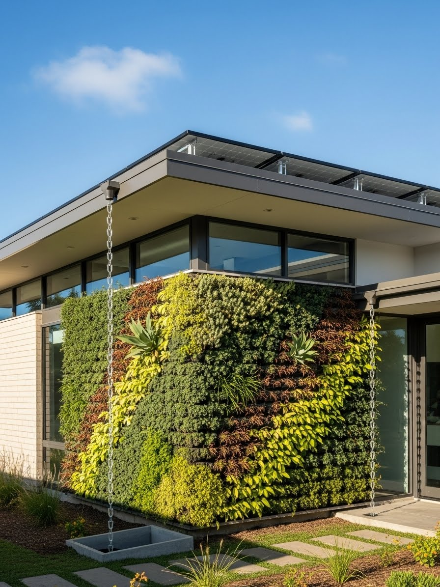
Environmental systems become visible architectural elements rather than hidden afterthoughts. Solar panels integrate into the roof design as a deliberate compositional element rather than a tacked-on addition, their regular geometry creating a textured plane that generates electricity while defining the home’s profile. A living green wall covering a portion of the facade provides insulation, stormwater management, and visual softness that contrasts with harder building materials.

Rainwater collection chains visible on the facade celebrate water management as architectural feature. These chains guide rainwater from roof to collection barrels or infiltration basins below, turning the physics of water flow into a kinetic sculptural element during rainstorms. Bright fresh morning light emphasizes the green wall’s vitality and makes the solar panels’ dark surfaces read as intentional design elements. This approach to eco-friendly design makes sustainable systems legible and beautiful rather than hiding them behind conventional facades.


24. Luxury Townhouse with Laser-Cut Screens

Limestone cladding signals permanence and quality—this sedimentary stone has been used in prestigious architecture for millennia because it ages gracefully and conveys substance. The intricate laser-cut metal privacy screens on the balconies provide contemporary counterpoint, their delicate patterns contrasting with the limestone’s solid mass. These screens serve practical purposes—privacy from neighbors, sun shading, safety railings—while adding visual richness through pattern and shadow.
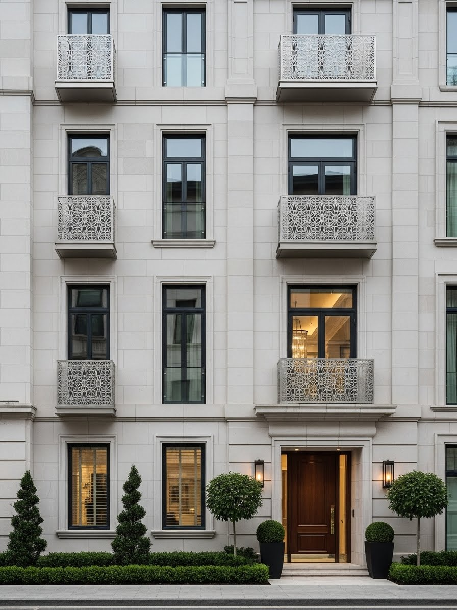
Street-level perspective emphasizes the townhouse’s vertical proportions and its relationship to neighboring structures. In dense urban contexts, balcony privacy becomes essential; solid railings would feel fortress-like, but perforated metal screens maintain openness while blocking direct sightlines. The elegant, refined aesthetic positions this as high-end urban living where details matter and craftsmanship is valued. Laser-cutting technology enables complex patterns impossible to achieve through traditional metalworking, allowing contemporary ornament that would have been prohibitively expensive a generation ago.
25. Modular Offset Volumes

Modular construction—building in factory-controlled sections then assembling on site—becomes an architectural strategy rather than a compromise. Offset rectangular volumes create a dynamic composition that clearly expresses the modular system while avoiding the monotony that can plague prefabricated housing. The facade mixes smooth white panels with textured dark wood, giving each module distinct identity while maintaining overall coherence.

A cantilevered carport covering a luxury vehicle demonstrates how modular design can incorporate spatial drama. The cantilever isn’t just showing off—it provides covered parking without dedicating ground-floor interior space to a garage. Sunset view catches the white panels with warm light while the dark wood recedes into shadow, emphasizing the three-dimensional quality of the offset volumes. This approach to modular design proves that factory construction can produce architecture with individual character rather than cookie-cutter repetition.
0 Comments