Modern residential facades have evolved far beyond simple walls and windows. Today’s architects use bold materials, dramatic lighting, and innovative structural forms to create homes that make a statement from the street. This collection showcases twenty distinct approaches to facade design, from cantilevered volumes and parametric screens to industrial conversions and transparent glass pavilions.
Each example demonstrates how thoughtful material choices, geometric composition, and contextual awareness can transform a building’s exterior into architecture worth stopping for.
Table of Contents
1. Cantilevered Drama in Zinc and Stone

The dramatic cantilever creates immediate visual tension—a heavy upper volume appears to float above a transparent ground floor. Dark zinc cladding wraps the projecting second story, its metallic finish contrasting sharply with the rough-hewn stone walls and floor-to-ceiling glass below. This vertical material hierarchy establishes clear functional separation: the private upper level reads as solid and protective, while the ground floor dissolves into openness.
Twilight timing amplifies the effect. Warm interior lighting glows through the glass, turning the transparent base into a lantern that highlights the structural boldness overhead. The minimal landscaping keeps attention focused on the architecture itself, while the three-quarter viewing angle reveals both the cantilever’s depth and the interplay between materials along the facade.
2. Parametric Screening and Angular Geometry

Sharp white concrete planes intersect at aggressive angles, creating a sculptural form that reads as architecture-as-object. The parametric perforated metal screen—a patterned panel system generated through computational design—acts as a privacy veil across portions of the facade. This secondary layer filters light and views while adding textural depth to the otherwise monolithic concrete volumes.

Deep recessed balconies carve negative space into the massing, creating shadows that emphasize the geometric precision. Midday sunlight intensifies these contrasts, casting crisp shadow lines that shift throughout the day. The low camera angle accentuates the building’s sculptural presence, making it appear to rise powerfully from the ground plane.
3. Rhythmic Timber Volumes in Motion

Wooden boxes appear to shift and slide across the facade, creating a rhythmic composition that breaks the static quality typical of multi-unit housing. Vertical timber slats wrap these protruding volumes, providing rich texture against the smooth grey stucco that forms the building’s base layer. This material dialogue—rough versus refined, warm versus cool—adds visual complexity without overwhelming the composition.
Staggered balconies cascade down the facade, ensuring each unit maintains outdoor space while the setbacks prevent a monotonous stacked appearance. The street-level perspective grounds the building in its residential context, with manicured hedges reinforcing the connection between architecture and landscape. Soft overcast lighting eliminates harsh shadows, allowing the material textures and volumetric composition to read clearly.
4. Brutalist Concrete Meets Woodland Setting

Board-formed concrete walls display the raw texture of wooden formwork, every plank line preserved in the cured surface. This brutalist approach celebrates construction honesty—the facade tells the story of how it was made. Expansive frameless glazing provides transparent counterpoints to the heavy concrete, while a large circular window punctures the rectilinear geometry, softening the composition with an unexpected geometric gesture.

The wooded setting transforms how the brutalist aesthetic reads. Instead of appearing harsh or institutional, the raw concrete textures echo natural bark and stone, while dappled sunlight filtering through trees adds movement and warmth to surfaces that might otherwise feel cold. The integration demonstrates how context can fundamentally shift material perception.
5. High-Contrast Charred Wood and White Render
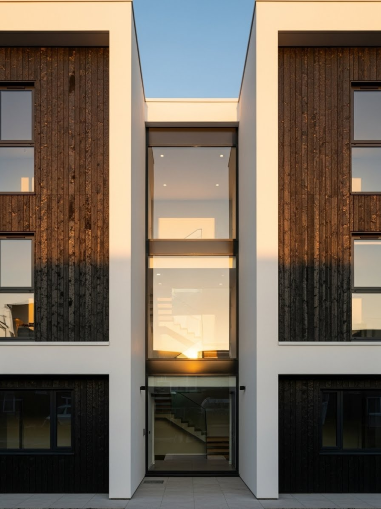
Black charred wood siding—created through the Japanese shou sugi ban technique of controlled burning—forms a dark, textured skin on one portion of the facade, while bright white render creates stark contrast on adjacent surfaces. This binary material palette generates high visual impact through opposition alone. The double-height glass atrium slices through the center, revealing a floating staircase that becomes a focal point and adds depth to what could otherwise read as a flat composition.
Golden hour lighting reflects off the glass, warming the intersection between materials and animating the staircase within. The symmetrical composition centers the glass volume, creating balance despite the dramatic material contrast. This approach demonstrates how controlled oppositions—dark versus light, opaque versus transparent, textured versus smooth—can organize a facade without requiring complex geometry.
6. Curved Glass and Vertical Gardens

Curved glass corners soften what horizontal white bands might otherwise make harsh, creating a fluid composition that wraps the building continuously. The white bands read as structural ribbons that define each floor level, while the glass corners eliminate hard edges and expand interior views. Integrated planter boxes on every level transform the facade into a living vertical garden, introducing organic elements that contrast with the geometric precision of the architecture.
The aerial drone perspective looking down at the corner reveals how the curved glass negotiates the building’s edge condition. From this angle, the planted boxes create a cascading green pattern that breaks down the facade’s scale and connects the architecture to landscape principles. This integration of vegetation directly into the facade system represents an architectural approach where greenery is structural, not decorative.
7. Elevated Glass Box on Steel Pilotis

The entire residence lifts off the ground on slender steel pilotis—the French architectural term for supporting columns—creating the illusion of a glass box floating above the landscape. This elevation strategy preserves the natural meadow below while establishing the home as a viewing platform suspended in space. The transparent envelope reveals the interior structure, showing mid-century modern influences reinterpreted through contemporary detailing and glass technology.

Early morning mist enhances the ethereal quality, softening edges and making the elevation appear even more pronounced. The meadow flows uninterrupted beneath the structure, demonstrating how lifting a building can be less invasive than spreading it across the site. The minimalist material palette—glass and steel only—keeps focus on the structural concept rather than surface decoration.
8. Industrial Conversion with Factory Windows

Expansive steel-framed factory windows dominate the facade, their grid pattern and industrial scale immediately signaling the building’s warehouse origins. Reclaimed red brick provides authentic texture and historical continuity, while exposed I-beams painted matte black read as honest structural elements rather than hidden infrastructure. This industrial-to-residential conversion maintains the building’s original character instead of disguising it.
The grand steel entry door anchors the street-level view, its oversized proportions appropriate to the industrial scale. The conversion aesthetic works because it respects the building’s DNA—the windows weren’t reduced to residential scale, the brick wasn’t covered, and the structure wasn’t concealed. The result demonstrates how adaptive reuse can create luxury living while celebrating industrial heritage.
9. Stacked Container Modules with Shifting Geometry

Shipping container-style modules stack vertically but rotate slightly on each level, creating dynamic overhangs and deep shadows that prevent the composition from reading as a simple stack. The varying shades of matte grey and anthracite provide subtle differentiation between modules while maintaining a cohesive industrial palette. Large sliding glass doors open each module onto private decks, transforming utilitarian forms into habitable living spaces with controlled connections to exterior air and light.

Sunset lighting emphasizes the geometry—rotated modules cast shadows on those below, creating a play of light and dark that shifts throughout the day. The slight rotations also provide weather protection for the decks while adding visual movement to what could otherwise be a static composition. This approach shows how modest geometric adjustments can transform repetitive modular elements into dynamic architecture.
10. Curved Roofline Echoing Landscape

The curved roofline mimics the rolling hills surrounding the site, establishing a direct formal relationship between building and landscape. This organic modern approach—where architecture responds to natural topography rather than imposing geometric orders—creates visual harmony with the context. Warm sandstone cladding grounds the building in local geology, while copper panels beginning to patina introduce a living material that changes color over time, developing blue-green tones as oxidation progresses.

The panoramic view captures how the building integrates rather than contrasts with its setting. The curve flows rather than breaks the horizon line, making the architecture appear to emerge from rather than dominate the landscape. This contextual sensitivity demonstrates an alternative to the object-building approach, where success is measured by how well the structure belongs to its place.
11. Translucent Channel Glass Urban Townhouse

Translucent channel glass forms the entire facade—a material system of U-shaped glass panels that transmit light while obscuring clear views, providing privacy without sacrificing luminosity. At night, the facade glows softly from interior lighting, transforming the narrow townhouse into an urban lantern. Black metal framing provides minimal structural expression at the edges, emphasizing verticality and containing the glowing surface.

The wet pavement reflection doubles the effect during blue hour, that brief period after sunset when ambient light turns deep blue. The moody atmosphere suits the urban density, where narrow lots require creative solutions for privacy and light. The translucent approach solves both: the home receives daylight and provides nighttime glow while maintaining separation from the street and adjacent buildings.
12. Jigsaw Puzzle Pattern with Cedar Loggias

Alternating solid white panels and recessed loggias create a jigsaw-puzzle pattern that breaks down the mid-rise building’s scale through rhythmic variation. The loggias—covered outdoor spaces integrated into the building volume—are lined with warm cedar wood, providing textured refuge against the smooth white surfaces. This push-pull composition adds depth to the facade, preventing the flat appearance typical of many mid-rise residential buildings.
The corner view reveals the facade’s actual depth, showing how the recesses create substantial shadow and spatial variety. Against a bright blue sky, the white panels read crisply while the cedar-lined loggias appear as warm interruptions. The pattern demonstrates how a simple alternating system can generate visual interest across multiple floors without requiring complex or expensive detailing.
13. Deconstructivist Titanium Villa

Fragmented planes and tilted walls reject traditional architectural symmetry, creating a composition that appears to be in motion or mid-transformation. Titanium panels clad these intersecting surfaces, their metallic finish reflecting light at varying angles depending on each plane’s orientation. This deconstructivist approach—an architectural philosophy that fragments and destabilizes conventional building forms—challenges expectations of what residential architecture should look like.
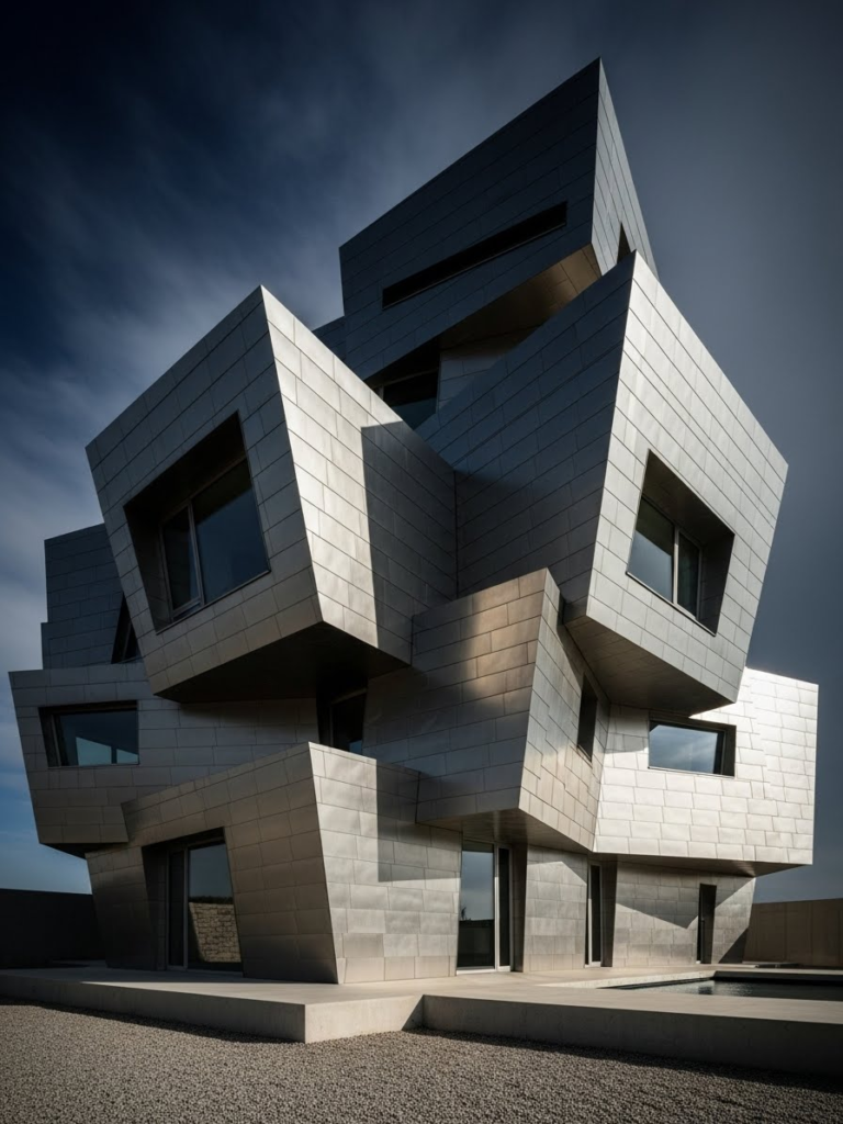
Sharp, high-contrast lighting accentuates the metallic texture and complex geometry, creating hard shadow lines where planes intersect. The titanium’s reflective quality means the facade changes appearance throughout the day as light angles shift. This dynamic surface behavior suits the unstable geometry, where nothing appears static or resolved. The villa demonstrates how material choice can reinforce architectural intent.
14. Tropical Double-Skin Wooden Louvers

A double-skin facade wraps the upper level—an outer layer of operable wooden louvers positioned in front of the building envelope proper. This climate-responsive system allows residents to adjust the louvers for sun control, ventilation, and privacy while maintaining views outward. The ground level contrasts completely: open-plan with travertine flooring extending seamlessly to the patio, dissolving the boundary between interior and exterior.

Lush palm shadows cast on the wooden louvers emphasize the tropical context and demonstrate how the facade interacts with its environment. The louver system responds to high sun angles and humidity typical of tropical climates, reducing heat gain while promoting airflow. The travertine ground plane reinforces the connection to outdoor living, a priority in warm climates where exterior space functions as habitable area much of the year.
15. Monochromatic Black Gable House

A traditional gable silhouette receives radical treatment through complete coverage in matte black standing seam metal—a roofing material that creates vertical linear texture through its raised seams. The monochromatic approach eliminates visual distraction, making the simple form appear bold rather than basic. A recessed entrance niche in light oak wood creates the only color contrast, functioning as a focal point that draws attention through opposition.
The symmetrical front elevation reinforces the archetypal house form while the black treatment makes it contemporary. Against a snowy landscape, the dark mass appears even more striking, creating maximum contrast with its context. The standing seam metal’s matte finish prevents glare, keeping the form readable as pure shape rather than reflective surface. This demonstrates how a single material applied consistently can transform a familiar form into something unexpected.
16. Mediterranean Modern with Terracotta Sunscreens

Smooth white plaster walls reference Mediterranean tradition while arched openings with sleek black steel frames add contemporary refinement. Terracotta baguette sunscreen elements—thin ceramic rods arranged to block high sun while maintaining views—respond to the warm climate functionally while providing terracotta’s characteristic warm color. This fusion respects regional building culture without copying historical styles directly.
Warm afternoon sun hitting the textured plaster emphasizes the material’s handcrafted quality and creates subtle shadows where the terracotta sunscreens project from the wall plane. The black steel frames contain the arched openings crisply, preventing the arches from reading as historical pastiche. The combination demonstrates how traditional forms and materials can be reinterpreted through contemporary detailing and climate-responsive elements.
17. Transparent Glass Pavilion with Deep Overhangs

A massive flat roof supported by slender columns creates deep overhangs that define outdoor space while the facade below remains almost entirely transparent. Floor-to-ceiling glass dissolves the boundary between interior and exterior, making the furniture and interior composition visible and integral to the architectural expression. The pavilion typology—where a simple roof shelters open space beneath—prioritizes openness and connection to landscape over enclosure.
Twilight timing shows interior and exterior simultaneously: the glass becomes both transparent and slightly reflective, the furniture reads clearly, and the deep overhangs define shadow zones that expand the perceived living area beyond the glass walls. The slender columns appear to effortlessly support the heavy horizontal plane above, creating a visual lightness despite the roof’s mass. This demonstrates how structural expression and material transparency can work together to dissolve architecture’s boundaries.
18. Gabion Stone and Corten Steel Texture Study

Gabion walls—wire mesh cages filled with local grey stones—form the textured ground level, their rough, irregular surface contrasting sharply with smooth corten steel panels on the upper level. Corten is weathering steel that develops a stable rust patina over time, creating a warm orange-brown finish that protects the metal from further corrosion. The contrast between rough stone and smooth rusted metal becomes the architectural focus, with each material’s texture and color intensifying the other through opposition.
The close-up architectural detail shot emphasizes material qualities over overall form. The stone’s irregular texture catches light differently on every surface, while the corten’s even patina creates a consistent warm tone. This pairing demonstrates how contrasting materials at different building levels can create hierarchy while both materials reference natural weathering processes—stones shaped by geological time, steel deliberately rusted.
19. Twisted Tower with Rotating Floors

Each floor rotates slightly from the one below, creating a twisting tower effect that transforms a simple stacked program into a dynamic form. The material palette—glass, white aluminum composite panels, and vertical green walls—varies on each level, with the rotation ensuring every unit receives different solar exposures and views. The vertical green walls introduce living vegetation directly into the facade system, softening the geometric manipulation with organic texture.

Viewed from a pedestrian perspective looking up, the rotation appears more pronounced, emphasizing the building’s sculptural ambition. The twisting strategy also provides natural shading: upper floors cantilever over lower ones, reducing direct sun exposure. This demonstrates how a geometric concept can serve multiple purposes simultaneously—creating visual interest, improving environmental performance, and differentiating individual units within a repetitive program.
20. Smart Glass Exoskeleton Tower

A smart-glass curtain wall forms the building envelope—an electronically controlled glass technology that transitions from opaque to clear on demand, allowing residents to adjust privacy and solar gain. The structural system expresses itself externally as a white steel diagrid exoskeleton, where diagonal members form a triangulated pattern that carries loads on the building’s exterior rather than through internal columns. This structural expression creates a high-tech aesthetic where the engineering becomes the architecture.
Bright neutral daylight emphasizes the clean, precise detailing and the smart glass in its clearer state, revealing the building’s internal organization. The diagrid pattern creates visual rhythm across the facade while the structural logic remains readable. This approach represents architecture where technology and structure merge into a single integrated system, the facade performing multiple functions—enclosure, structure, climate control, and privacy—simultaneously.
0 Comments